Documentation of Josef Albers Transparency


----------------------------------------------------------------------------------------------------------------------
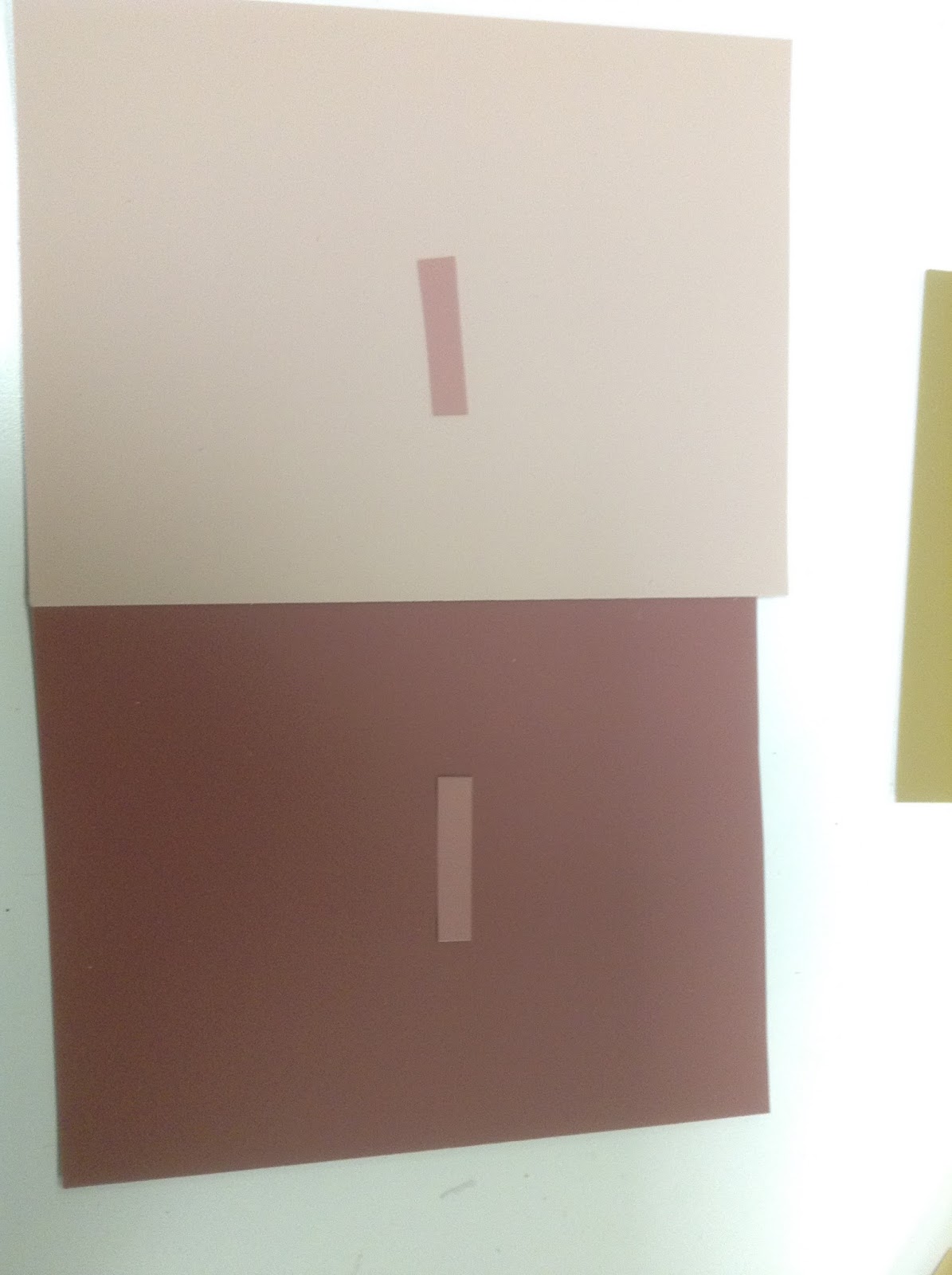
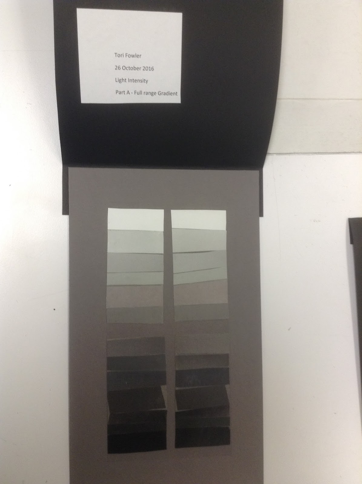
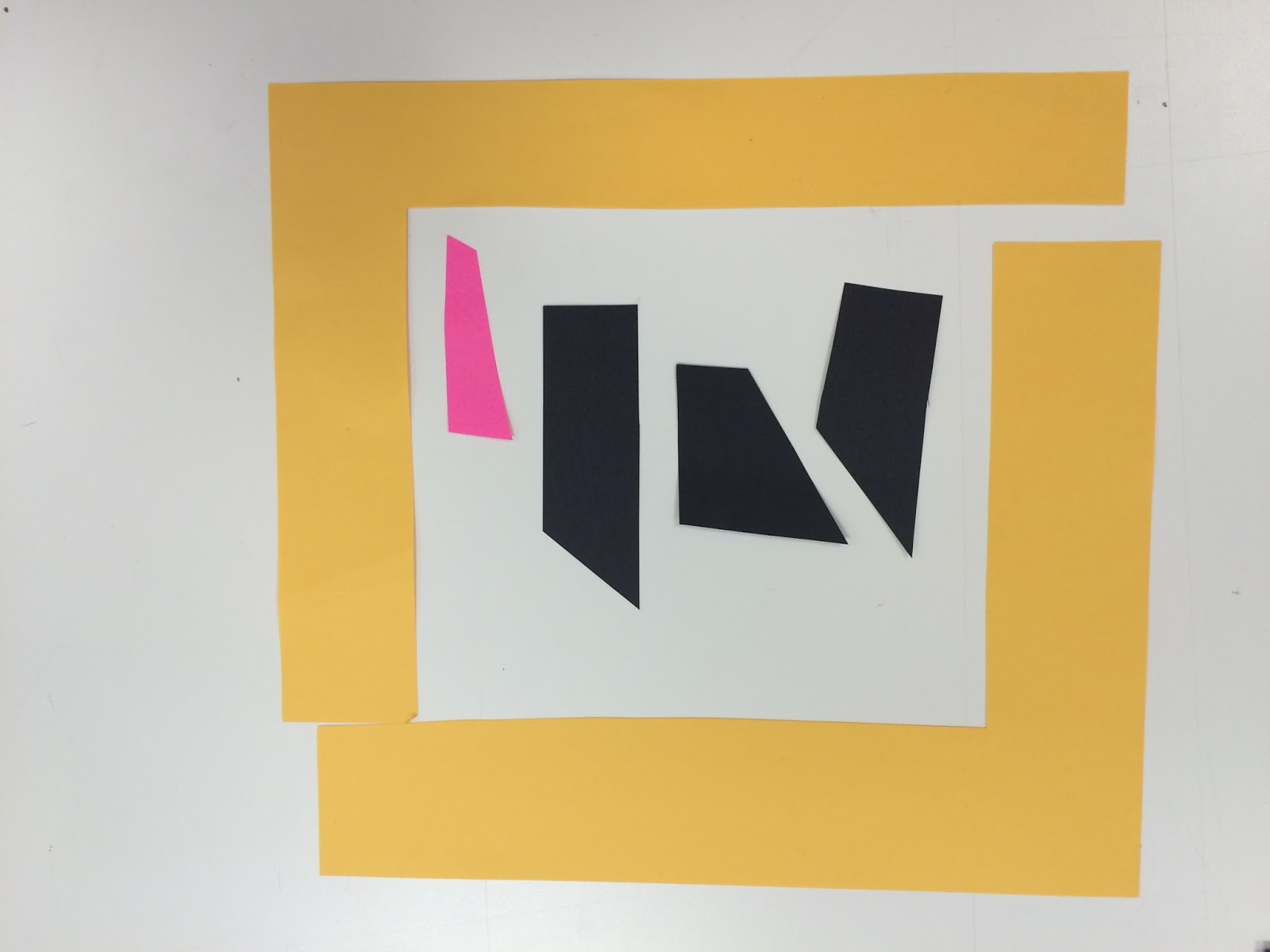
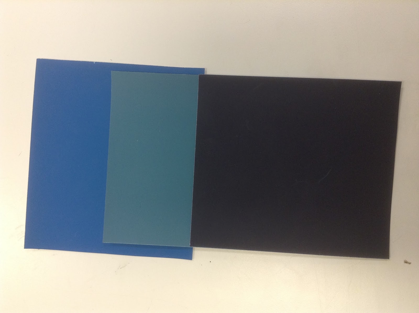
Final Pieces


This assignment's main goal was to have two colors, with another in the middle to make the illusion of transparency. The look was made by finding three colors to go in betweenfor : top on top, imbetween, and bottom on top. This challenged my abilities to decipher what a color is adding and what colors take away certain color.